Stacked header
Line-drawn logo on the left, three rows of tiny links split by a hairline, bold shop nav and a filled red cart button; on phones a bar with Menu, Search, Log in and a red cart block, and a menu panel that drops open.
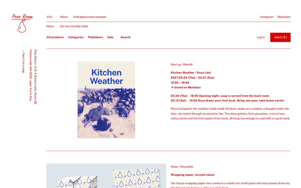
Part of the style
Red Pen Shop
6 parts that belong together, with their tokens, type and rules.
https://kitbash.me/components/red-pen-shop/masthead/figma.html?palette=36d23f795e300a87
Use the Figma MCP server (https://mcp.figma.com/mcp). Download https://kitbash.me/components/red-pen-shop/masthead/figma.html?palette=36d23f795e300a87 and pass that whole HTML document to the html_to_figma tool, so the part "Stacked header" lands as editable layers in my open Figma file. Fonts come from Google Fonts: if a face is missing in Figma, pick the closest one.
Code
<style>
/* Goes after the pack's base.css */
:root {
  --red: #0f111b;
  --paper: #6fa0ff;
  --ground: #5a81ce;
  --ground-shade: #4b6caa;
  --cover-cream: #638ee1;
  --cover-navy: #422e1b;
  --cover-cobalt: #351d02;
  --cover-pink: #45506d;
  --cover-mustard: #364c7c;
  --peg: #4c576f;
  --cover-lemon: #607bb6;
  --peg-hole: #0d1628;
  --cover-leaf: #4d3825;
  --cover-neon: #cca076;
}
</style>

<header class="masthead">
  <div class="masthead__bar">
    <button class="masthead__menu" type="button" aria-expanded="false">
      <span class="masthead__burger" aria-hidden="true"></span>
      Menu
    </button>
    <a class="masthead__bar-link" href="#">Search</a>
    <a class="masthead__bar-link" href="#">Log in</a>
    <a class="masthead__cart masthead__cart--bar" href="#">Cart ( 0 )</a>
  </div>
  <div class="masthead__panel">
    <nav class="masthead__panel-inner" aria-label="Shop">
      <a class="masthead__panel-link" href="#">All products</a>
      <a class="masthead__panel-link" href="#">Categories</a>
      <a class="masthead__panel-link" href="#">Publishers</a>
      <a class="masthead__panel-link" href="#">Sale</a>
    </nav>
  </div>

  <div class="masthead__frame">
    <a class="masthead__logo" href="#" aria-label="Pear Room, home">
      <svg class="masthead__mark" viewBox="0 0 120 108" aria-hidden="true">
        <text class="masthead__word" x="6" y="30">Pear Room</text>
        <path class="masthead__line" d="M8 38 C30 34 60 35 84 36 C96 36.5 104 34 110 28" />
        <path class="masthead__line" d="M60 50 C52 50 50 59 50 64 C50 70 40 74 40 87 C40 98 49 104 60 104 C71 104 80 98 80 87 C80 74 70 70 70 64 C70 59 68 50 60 50 Z" />
        <path class="masthead__line" d="M60 50 C60 46 61 43 64 40" />
        <path class="masthead__line" d="M63 44 C67 38 75 38 78 40 C74 45 67 46 63 44 Z" />
        <path class="masthead__line" d="M47 88 C47 82 50 78 54 76" />
      </svg>
    </a>

    <div class="masthead__rows">
      <nav class="masthead__row masthead__row--info" aria-label="About the shop">
        <div class="masthead__group">
          <a class="masthead__link" href="#">Visit</a>
          <a class="masthead__link" href="#">About</a>
          <a class="masthead__link" href="#">hello@pearroom.example</a>
        </div>
        <div class="masthead__group">
          <a class="masthead__link" href="#">Instagram</a>
          <a class="masthead__link" href="#">Mastodon</a>
        </div>
      </nav>
      <nav class="masthead__row masthead__row--news" aria-label="News">
        <div class="masthead__group">
          <a class="masthead__link" href="#">News</a>
          <a class="masthead__link" href="#">Get the monthly letter</a>
        </div>
      </nav>
      <nav class="masthead__row masthead__row--shop" aria-label="Shop sections">
        <div class="masthead__group masthead__group--bold">
          <a class="masthead__link" href="#">All products</a>
          <a class="masthead__link" href="#">Categories</a>
          <a class="masthead__link" href="#">Publishers</a>
          <a class="masthead__link" href="#">Sale</a>
          <a class="masthead__link" href="#">Search</a>
        </div>
        <div class="masthead__group">
          <a class="masthead__link" href="#">Log in</a>
          <a class="masthead__cart" href="#">Cart ( 0 )</a>
        </div>
      </nav>
    </div>
  </div>
</header>

<style>
  .masthead {
    background: var(--paper);
    color: var(--red);
  }
  .masthead a {
    color: inherit;
    text-decoration: none;
  }
  .masthead__frame {
    display: grid;
    grid-template-columns: var(--rail) minmax(0, 1fr);
    padding: var(--space-xl) var(--gutter) var(--space-l);
  }
  .masthead__logo {
    display: block;
    width: clamp(5.5rem, 7.6vw, 6.875rem);
    align-self: start;
  }
  .masthead__mark {
    width: 100%;
    height: auto;
    overflow: visible;
  }
  .masthead__word {
    fill: var(--red);
    font-family: var(--font-mark);
    font-size: 31px;
    font-weight: 500;
    letter-spacing: -0.01em;
  }
  .masthead__line {
    fill: none;
    stroke: var(--red);
    stroke-width: 2;
    stroke-linecap: round;
    stroke-linejoin: round;
  }

  .masthead__row {
    display: flex;
    flex-wrap: wrap;
    justify-content: space-between;
    column-gap: var(--space-l);
  }
  .masthead__row--info {
    border-bottom: var(--rule) solid var(--red);
  }
  .masthead__row--shop {
    margin-top: var(--space-s);
  }
  .masthead__group {
    display: flex;
    flex-wrap: wrap;
    align-items: center;
    column-gap: clamp(0.75rem, 1.4vw, 1.25rem);
  }
  .masthead__group--bold {
    font-weight: 700;
    letter-spacing: var(--tracking-bold);
  }
  .masthead__link {
    display: inline-flex;
    align-items: center;
    min-height: var(--tap);
    min-width: var(--tap);
    text-underline-offset: 3px;
  }
  .masthead__link:hover,
  .masthead__link:focus-visible {
    text-decoration: underline;
    text-decoration-thickness: var(--rule);
  }

  .masthead__cart {
    display: inline-flex;
    align-items: center;
    justify-content: center;
    min-height: var(--tap);
    padding: 0 var(--space-m) 0 1.25rem;
    border: var(--rule) solid var(--red);
    background: var(--red);
    color: var(--paper) !important;
    font-weight: 700;
    letter-spacing: var(--tracking-bold);
    white-space: pre;
    transition: background-color var(--quick) var(--ease), color var(--quick) var(--ease);
  }
  .masthead__cart:hover,
  .masthead__cart:focus-visible {
    background: var(--paper);
    color: var(--red) !important;
  }
  .masthead a:focus-visible,
  .masthead button:focus-visible {
    outline: var(--rule) solid var(--red);
    outline-offset: 2px;
  }

  /* Phone bar and its menu panel. Hidden from tablet up. */
  .masthead__bar,
  .masthead__panel {
    display: none;
  }

  @media (max-width: 47.99rem) {
    .masthead__bar {
      display: flex;
      align-items: stretch;
      border-bottom: var(--rule) solid var(--red);
    }
    .masthead__menu {
      display: inline-flex;
      align-items: center;
      gap: var(--space-s);
      min-height: var(--tap);
      margin-right: auto;
      padding: 0 1.5rem 0 var(--gutter);
      border: 0;
      border-right: var(--rule) solid var(--red);
      background: none;
      color: var(--red);
      font: inherit;
      letter-spacing: inherit;
      cursor: pointer;
    }
    .masthead__burger {
      position: relative;
      width: 15px;
      height: 9px;
      border-block: var(--rule) solid currentColor;
      transition: border-color var(--slow) var(--ease);
    }
    .masthead__burger::after {
      content: "";
      position: absolute;
      left: 0;
      right: 0;
      top: 3px;
      border-top: var(--rule) solid currentColor;
      transition: transform var(--slow) var(--ease);
    }
    .masthead__burger::before {
      content: "";
      position: absolute;
      left: 0;
      right: 0;
      top: 3px;
      border-top: var(--rule) solid transparent;
      transition: transform var(--slow) var(--ease), border-color var(--slow) var(--ease);
    }
    .masthead.is-open .masthead__burger {
      border-color: transparent;
    }
    .masthead.is-open .masthead__burger::after {
      transform: rotate(45deg);
    }
    .masthead.is-open .masthead__burger::before {
      border-top-color: currentColor;
      transform: rotate(-45deg);
    }
    .masthead__bar-link {
      display: inline-flex;
      align-items: center;
      justify-content: center;
      min-width: var(--tap);
      min-height: var(--tap);
      padding: 0 var(--space-s);
    }
    .masthead__cart--bar {
      margin-left: var(--space-s);
      border-width: 0;
      padding-inline: var(--space-m) var(--gutter);
      font-weight: 400;
    }

    .masthead__panel {
      display: grid;
      grid-template-rows: 0fr;
      transition: grid-template-rows var(--slow) var(--ease);
    }
    .masthead.is-open .masthead__panel {
      grid-template-rows: 1fr;
    }
    .masthead__panel-inner {
      display: grid;
      overflow: hidden;
      padding-inline: var(--gutter);
      font-weight: 700;
      letter-spacing: var(--tracking-bold);
      visibility: hidden;
      transition: visibility 0s linear var(--slow);
    }
    .masthead.is-open .masthead__panel-inner {
      visibility: visible;
      transition-delay: 0s;
    }
    .masthead__panel-link {
      display: flex;
      align-items: center;
      min-height: var(--tap);
      border-bottom: var(--rule) solid var(--red);
    }

    .masthead__frame {
      grid-template-columns: auto minmax(0, 1fr);
      column-gap: var(--space-l);
      margin-inline: var(--gutter);
      padding: var(--space-l) 0 var(--space-m);
      border-bottom: var(--rule) solid var(--red);
    }
    .masthead__logo {
      width: 4.5rem;
    }
    .masthead__row--info {
      border-bottom: 0;
    }
    .masthead__row--shop {
      display: none;
    }
    .masthead__row {
      justify-content: flex-start;
    }
  }
</style>

<script>
  (() => {
    for (const root of document.querySelectorAll('.masthead')) {
      const toggle = root.querySelector('.masthead__menu');
      if (!toggle) continue;
      toggle.addEventListener('click', () => {
        const open = root.classList.toggle('is-open');
        toggle.setAttribute('aria-expanded', String(open));
      });
    }
  })();
</script>
Similar components
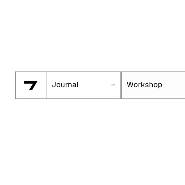
Hairline cell nav
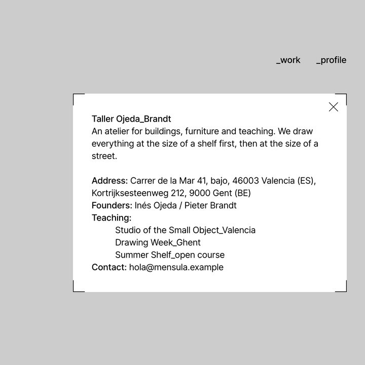
Masthead and profile
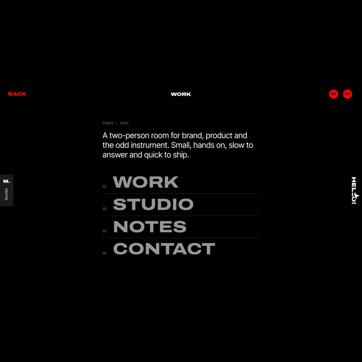
Dark top bar
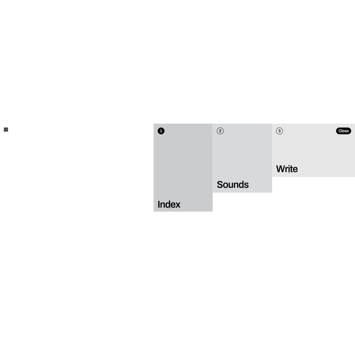
Corner nav with stepped panels
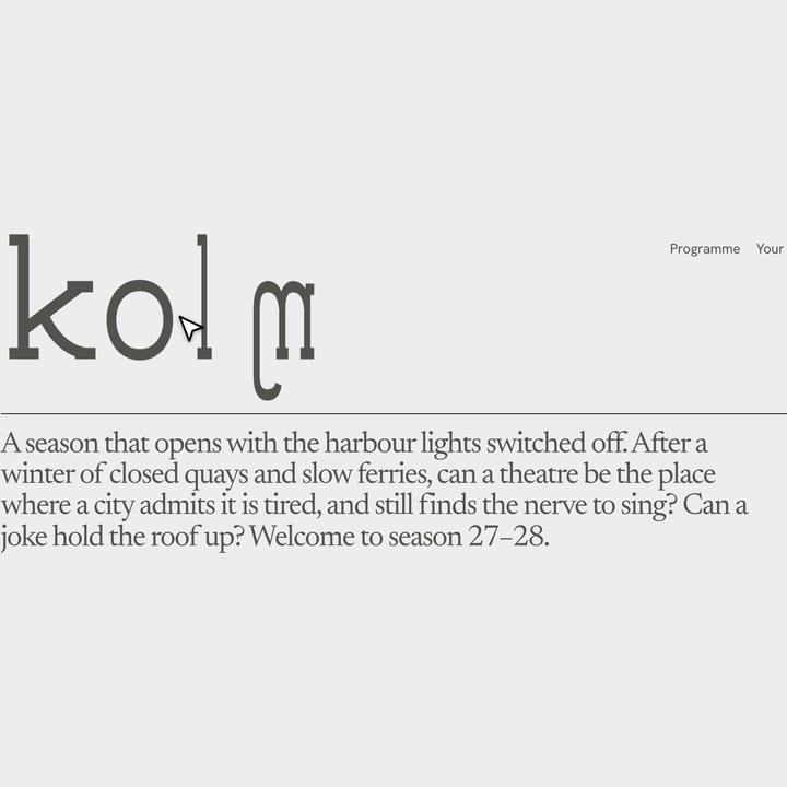
Masthead
Corner nav
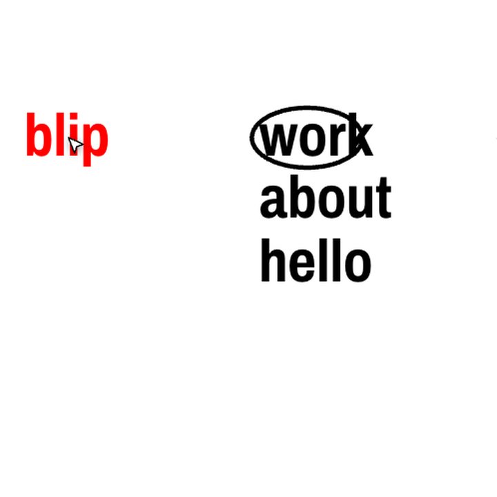
Corner masthead

Floating pill nav