Footer
A dusty rule, three centred columns (address, hours, contact with underlined links) and a closing line in capitals with a sign-up link and the copyright. Each column clears when pointed at or tabbed into.

Part of the style
Ink Bleed Serif
7 parts that belong together, with their tokens, type and rules.
https://kitbash.me/components/ink-bleed-serif/footer/figma.html?palette=7039e9575afad98f
Use the Figma MCP server (https://mcp.figma.com/mcp). Download https://kitbash.me/components/ink-bleed-serif/footer/figma.html?palette=7039e9575afad98f and pass that whole HTML document to the html_to_figma tool, so the part "Footer" lands as editable layers in my open Figma file. Fonts come from Google Fonts: if a face is missing in Figma, pick the closest one.
Code
<style>
/* Goes after the pack's base.css */
:root {
  --page: #dadedf;
  --ink: #1b0c13;
  --paper: #f7fcfd;
  --paper-soft: rgba(247, 252, 253, 0.6);
}
</style>

<footer class="footer">
  <svg class="footer__defs" width="0" height="0" aria-hidden="true" focusable="false">
    <filter id="footer-grain" x="-5%" y="-25%" width="110%" height="150%" color-interpolation-filters="sRGB">
      <feTurbulence type="fractalNoise" baseFrequency="0.9" numOctaves="1" seed="3" />
      <feDisplacementMap in="SourceGraphic" scale="11" xChannelSelector="R" yChannelSelector="G" />
    </filter>
  </svg>

  <hr class="footer__rule" />

  <div class="footer__columns">
    <div class="footer__column">
      <h2 class="footer__heading footer__ink">Find us</h2>
      <address class="footer__lines footer__ink">12 Lantern Row<br />behind the old tram shed<br />ring the brass bell</address>
    </div>
    <div class="footer__column">
      <h2 class="footer__heading footer__ink">Open</h2>
      <p class="footer__lines footer__ink">Tuesday to Sunday<br />seven until ten at night<br />Mondays we scrub</p>
    </div>
    <div class="footer__column">
      <h2 class="footer__heading footer__ink">Write</h2>
      <p class="footer__lines footer__ink">
        <a class="footer__inline" href="#">hello@mildsteam.example</a><br />
        <a class="footer__inline" href="#">Instagram</a>, <a class="footer__inline" href="#">Are.na</a><br />
        or a note under the door
      </p>
    </div>
  </div>

  <p class="footer__close footer__ink">
    <a class="footer__link" href="#">Sign up</a>
    <span class="footer__legal">Mild Steam ©2026</span>
  </p>
</footer>

<style>
  .footer {
    padding: 0 var(--edge) var(--space-l);
    text-align: center;
  }
  .footer__defs {
    position: absolute;
  }
  .footer__rule {
    height: var(--rule);
    margin: 0 0 var(--section-space);
    border: 0;
    background: var(--ink);
    filter: url("#footer-grain");
  }

  .footer__columns {
    display: grid;
    grid-template-columns: repeat(3, minmax(0, 1fr));
    gap: var(--space-l) var(--gap);
  }

  /* Each column, and the closing line, sits scattered until it is pointed at or tabbed into. */
  .footer__ink {
    filter: url("#footer-grain");
  }
  .footer__column:hover .footer__ink,
  .footer__column:focus-within .footer__ink,
  .footer__close:hover,
  .footer__close:focus-within {
    filter: none;
  }

  .footer__heading {
    margin: 0 0 var(--space-s);
    font: inherit;
    line-height: var(--leading-tight);
    text-transform: uppercase;
  }
  .footer__lines {
    margin: 0;
    font-style: normal;
  }
  .footer__inline,
  .footer__link {
    color: inherit;
    text-decoration: underline var(--rule);
    text-underline-offset: var(--underline-offset);
    transition: text-decoration-color var(--time) var(--ease);
  }
  .footer__inline:hover,
  .footer__inline:focus-visible,
  .footer__link:hover,
  .footer__link:focus-visible {
    text-decoration-color: transparent;
  }
  .footer__inline:focus-visible,
  .footer__link:focus-visible {
    outline: var(--rule) solid var(--ink);
    outline-offset: var(--rule);
  }

  .footer__close {
    display: flex;
    flex-wrap: wrap;
    justify-content: center;
    align-items: center;
    gap: 0 var(--space-m);
    margin: var(--section-space) 0 0;
    text-transform: uppercase;
  }
  .footer__link {
    display: inline-flex;
    align-items: center;
    min-height: var(--tap);
  }

  /* Three columns of this text size need room, so they stack early. */
  @media (max-width: 56rem) {
    .footer__columns {
      grid-template-columns: 100%;
    }
  }

  /* On small screens the lines stay sharp, with room around each link for a thumb. */
  @media (max-width: 44rem) {
    .footer__lines {
      filter: none;
    }
    .footer__inline {
      display: inline-flex;
      align-items: center;
      min-height: var(--tap);
    }
  }

  @media (prefers-reduced-motion: reduce) {
    .footer__inline,
    .footer__link {
      transition-duration: 0s;
    }
  }
</style>
Similar components
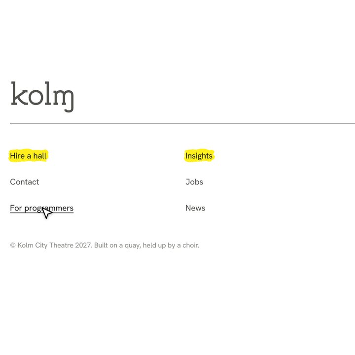
Footer
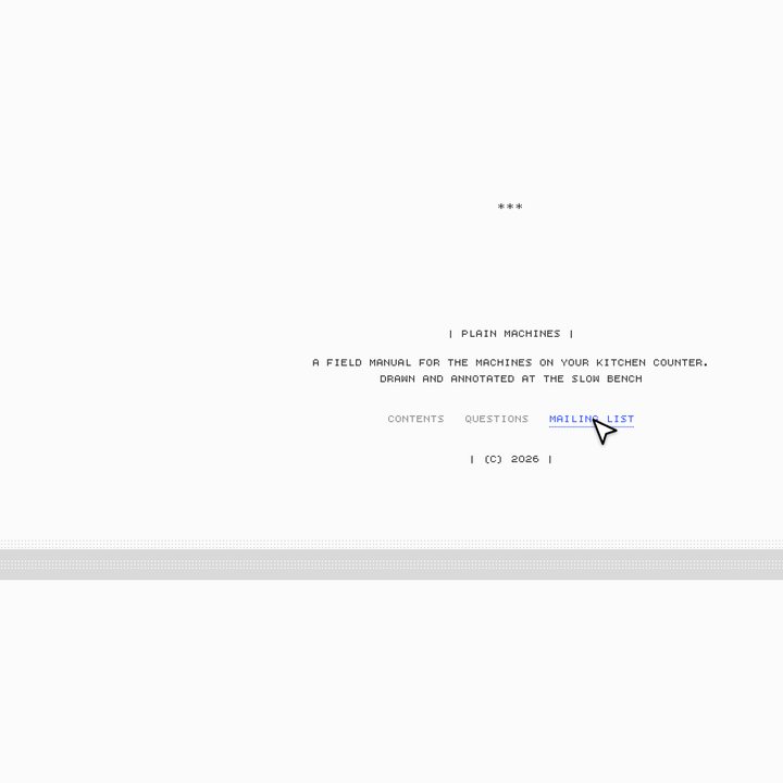
Colophon
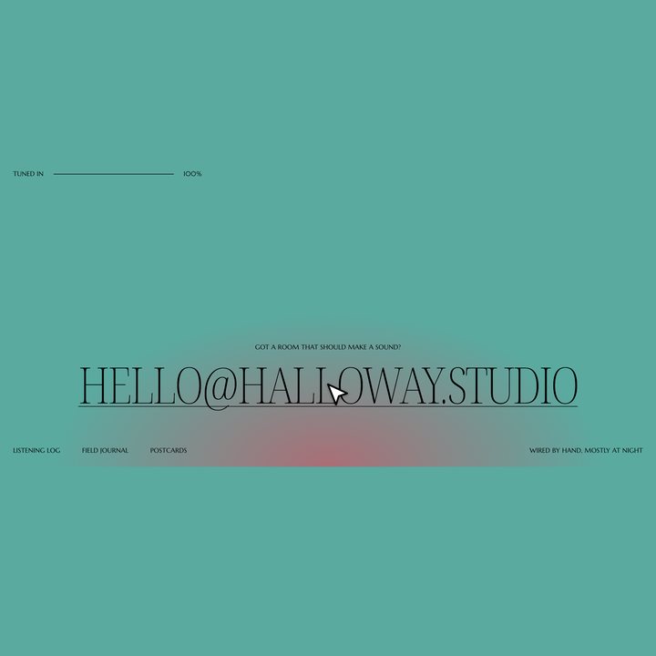
Contact footer
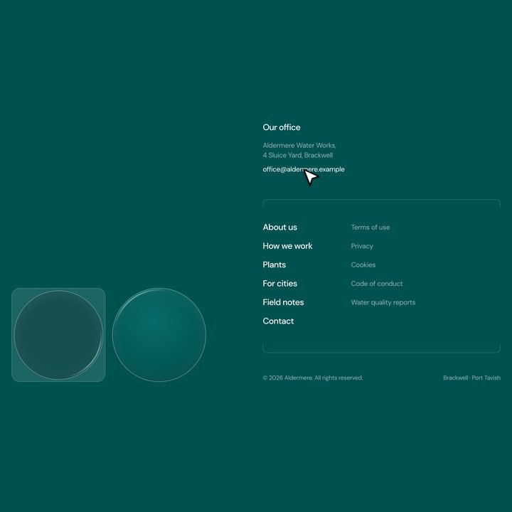
Glass footer
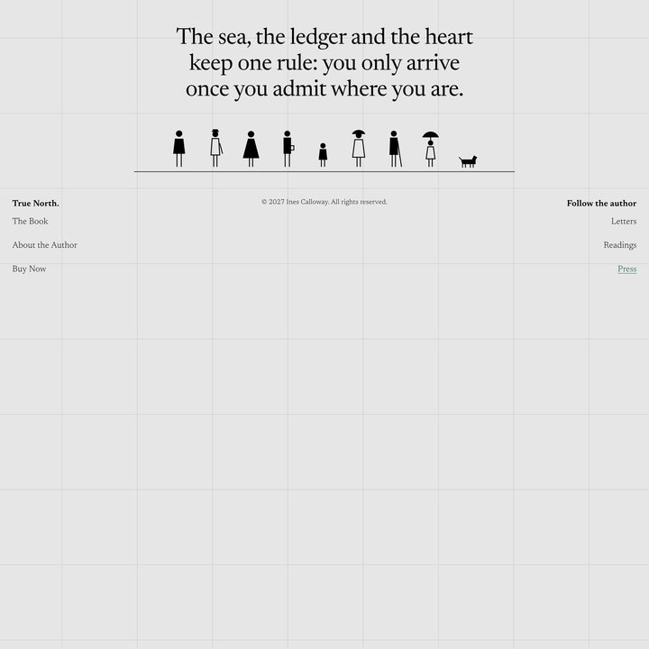
Closing and footer

Glow footer
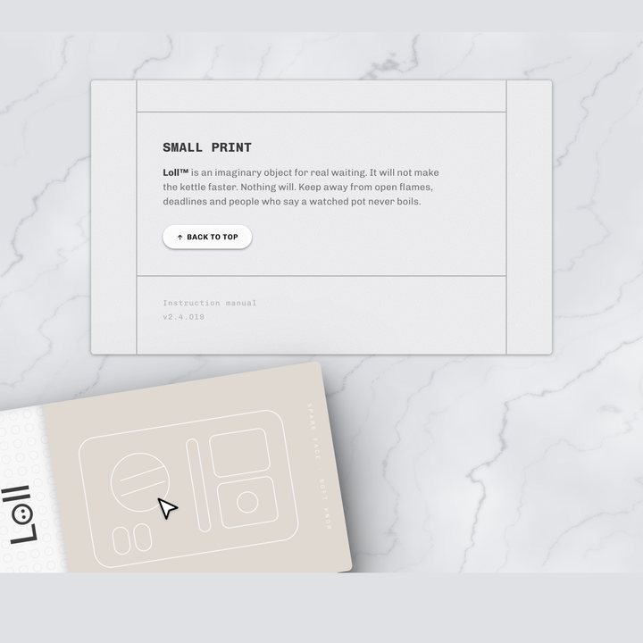
Sand box colophon

Wave footer