News
Ruled news rows, each with a small tilted cut-out from the collage (it straightens on hover), a short headline and a Read more button.
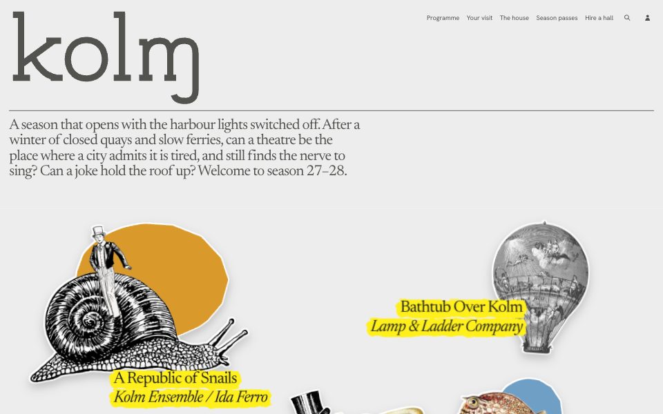
Part of the style
Cut-Out Playhouse
7 parts that belong together, with their tokens, type and rules.
https://kitbash.me/components/cut-out-playhouse/news/figma.html?palette=9c35948eb79ebaf4
Use the Figma MCP server (https://mcp.figma.com/mcp). Download https://kitbash.me/components/cut-out-playhouse/news/figma.html?palette=9c35948eb79ebaf4 and pass that whole HTML document to the html_to_figma tool, so the part "News" lands as editable layers in my open Figma file. Fonts come from Google Fonts: if a face is missing in Figma, pick the closest one.
Code
<style>
/* Goes after the pack's base.css */
:root {
  --page: #e7e7e5;
  --paper: #fafafa;
  --ink: #1d0d07;
  --ink-soft: #4e3f3a;
  --ink-faint: #817d74;
  --shadow: rgba(29, 13, 7, 0.22);
  --cut-cream: #e2e2e0;
  --cut-steel: #99968f;
  --cut-coal: #281812;
  --marker: #aa8679;
  --cut-ochre: #947a71;
  --cut-moss: #7b6963;
  --cut-sky: #aa8679;
  --cut-rust: #aa8679;
  --cut-skin: #edd7cf;
  --cut-plum: #aa8679;
}
</style>

<section class="news" aria-labelledby="news-heading">
  <h2 class="news__heading" id="news-heading">News</h2>
  <ul class="news__list">
    <li class="news__row">
      <img class="news__pic" src="assets/balloon.webp" alt="">
      <p class="news__text">Season 27–28 opens with the harbour lights switched off</p>
      <a class="news__button" href="#">Read more</a>
    </li>
    <li class="news__row">
      <img class="news__pic" src="assets/octopus.webp" alt="">
      <p class="news__text">Extra seats for The Salt Inventory, on the floor and in the rigging</p>
      <a class="news__button" href="#">Read more</a>
    </li>
    <li class="news__row">
      <img class="news__pic" src="assets/boxfish.webp" alt="">
      <p class="news__text">The house choir is looking for twelve low voices and one very high one</p>
      <a class="news__button" href="#">Read more</a>
    </li>
    <li class="news__row">
      <img class="news__pic" src="assets/top-hat.webp" alt="">
      <p class="news__text">Our halls are open for hire on dark Mondays</p>
      <a class="news__button" href="#">Read more</a>
    </li>
  </ul>
  <a class="news__all" href="#">View all news</a>
</section>

<style>
  .news {
    padding: var(--space-l) var(--edge) var(--space-xl);
    background: var(--paper);
    color: var(--ink-soft);
  }
  .news__heading {
    margin: 0;
    padding-bottom: var(--space-s);
    border-bottom: var(--hairline) solid var(--ink-soft);
    font-size: var(--text-s);
    font-weight: 400;
  }
  .news__list {
    margin: 0 0 var(--space-m);
    padding: 0;
    list-style: none;
  }
  .news__row {
    display: grid;
    grid-template-columns: 5.5rem minmax(0, 1fr) auto;
    align-items: center;
    column-gap: var(--space-l);
    padding: var(--space-s) 0;
    border-bottom: var(--hairline) solid var(--ink-soft);
  }
  .news__pic {
    width: 100%;
    height: 3.25rem;
    object-fit: contain;
    rotate: -4deg;
    filter:
      drop-shadow(1.5px 0 0 var(--paper)) drop-shadow(-1.5px 0 0 var(--paper))
      drop-shadow(0 1.5px 0 var(--paper)) drop-shadow(0 -1.5px 0 var(--paper))
      drop-shadow(0 4px 4px var(--shadow));
    transition: rotate var(--slow) var(--ease-out), scale var(--slow) var(--ease-out);
  }
  .news__row:nth-child(even) .news__pic { rotate: 5deg; }
  .news__row:hover .news__pic { rotate: 0deg; scale: 1.08; }
  .news__text {
    max-width: 34rem;
    margin: 0;
    font-size: var(--text-s);
    line-height: 1.3;
  }
  .news__button {
    display: inline-flex;
    align-items: center;
    min-height: var(--tap);
    padding: 0 var(--space-m);
    border-radius: var(--radius-button);
    background: var(--ink-soft);
    color: var(--paper);
    font-size: var(--text-s);
    text-decoration: none;
    white-space: nowrap;
    transition: background-color var(--slow) ease;
  }
  .news__button:hover,
  .news__button:focus-visible { background: var(--ink); }
  .news__all {
    display: flex;
    align-items: center;
    justify-content: center;
    min-height: 3.5rem;
    border: var(--hairline) solid var(--ink-soft);
    border-radius: var(--radius-button);
    color: var(--ink-soft);
    text-decoration: none;
    transition: background-color var(--slow) ease, border-color var(--slow) ease;
  }
  .news__all:hover,
  .news__all:focus-visible { background: var(--page); border-color: var(--ink); }

  @media (max-width: 48rem) {
    .news__row {
      grid-template-columns: minmax(0, 1fr) 6rem;
      row-gap: var(--space-s);
      padding: var(--space-m) 0;
    }
    .news__pic { grid-column: 2; grid-row: 1 / span 2; }
    .news__text { grid-column: 1; grid-row: 1; font-size: var(--text-m); }
    .news__button { grid-column: 1; grid-row: 2; justify-self: start; }
  }
</style>
Similar components
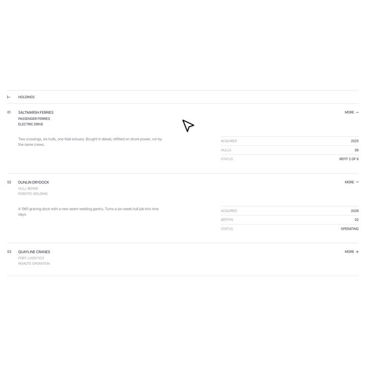
Investment ledger
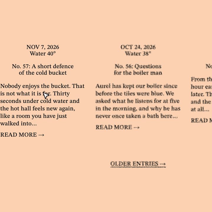
Entry columns
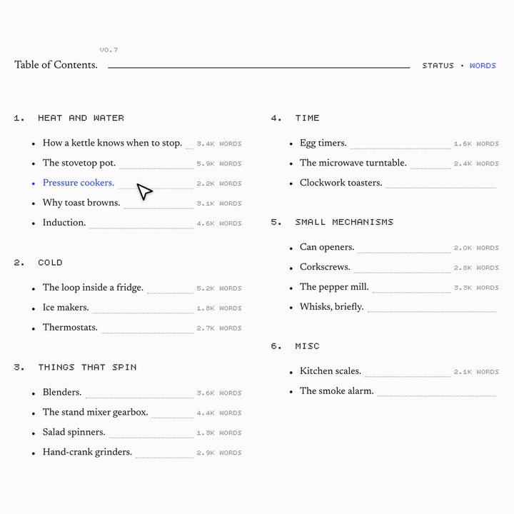
Table of contents with progress
Ray lab
Services list
Event list
Ringed services
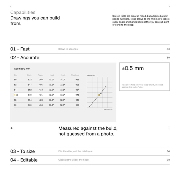
Capability rows